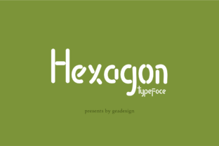
Hexagon Font: A Modern Typeface for Digital Designers
As a web designer, choosing the right typeface is one of the most impactful decisions you'll make. Fonts shape how users perceive your brand, influence readability, and contribute to the overall visual rhythm of a layout. Enter Hexagon, a unique rounded sans serif font that brings an organic yet professional feel to any digital project. Its clean curves and structured geometry make it ideal for modern websites, app interfaces, and branded content where clarity meets creativity.
Understanding Hexagon’s Visual Style and Personality
Hexagon is not just another sans serif font. It blends the softness of rounded edges with the precision of geometric forms, creating a typeface that feels both friendly and authoritative. This balance makes it versatile enough for use in hero sections, CTA buttons, and even body text when used thoughtfully. The font's subtle irregularities give it an artisanal touch, perfect for brands aiming to stand out without compromising legibility or professionalism.
The personality of Hexagon leans toward approachability and innovation. It's great for tech startups, creative agencies, lifestyle brands, and SaaS platforms that want to convey a sense of modernity while maintaining warmth. Whether you're designing a landing page for a new product or crafting a banner for an online store, this font adds a layer of sophistication that enhances user experience.
Applying Hexagon in Web Design and UI Layouts
In web design, typography plays a crucial role in guiding the user’s eye and establishing hierarchy. Hexagon works exceptionally well as a header font due to its strong presence and high contrast between letters. Its rounded forms also help soften the look of otherwise rigid layouts, making it especially effective in hero sections and banners where impact matters most.
- Hero Sections: Use Hexagon for bold, attention-grabbing headlines. Its clean lines ensure it remains legible on both desktop and mobile screens.
- Landing Pages: Pair it with more neutral sans serifs for body copy to maintain a consistent tone while still highlighting key messages.
- CTA Buttons: Hexagon’s compact and elegant form fits perfectly into short phrases like "Start Now" or "Get the Guide," encouraging clicks without overwhelming the interface.
- Brand-Focused Sites: If your client wants a fresh and modern brand identity, Hexagon can serve as the cornerstone of their typography system.
For UI designers working on app screens or dashboards, Hexagon offers a polished alternative to default system fonts. It helps create a cohesive look across all touchpoints, from navigation menus to modal windows. Just be sure to consider spacing and weight variations when using it in smaller sizes or tight grids.
Readability and Scanning Behavior in Responsive Design
One of the biggest challenges in digital design is ensuring that text is readable across devices. Hexagon performs admirably in responsive environments. Its open letterforms and generous x-height allow it to remain clear at smaller sizes, which is essential for mobile optimization. You’ll find it particularly useful in image overlays and social media graphics where text needs to pop quickly.
When designing for dark mode or light backgrounds, Hexagon adapts well. On dark backgrounds, its lighter strokes prevent the text from appearing too heavy. On white or pastel tones, it maintains crisp definition. For optimal scanning behavior, keep line lengths short and pair it with ample whitespace to avoid cognitive overload.
Where to Use Hexagon Best
While Hexagon is adaptable, it shines brightest in specific areas of a design. Here are some best practices based on real-world applications:
- Hero Titles: Ideal for large-scale headers. Its geometric appeal ensures it holds up visually even at maximum sizes.
- Section Headings: Adds character without sacrificing clarity. Use it sparingly to emphasize key sections.
- Logo Text: With the right alternates and weights, Hexagon can be an excellent choice for logo design—especially if your brand values modernity and approachability.
- Buttons and Short Phrases: Its simplicity and elegance work wonders for microcopy and interactive elements.
- Decorative Accents: Use bolder weights or special characters for subtle decorative touches in infographics or portfolio sites.
Creating a Consistent Brand Identity with Hexagon
A strong brand identity relies on consistency, and typography is a core part of that. Hexagon can anchor your brand’s visual language by providing a signature style for headers, titles, and key messaging. Its organic edge differentiates it from overly technical fonts, giving your brand a human-centric vibe.
Consider using Hexagon alongside a more utilitarian sans serif for body text. This pairing allows the brand voice to come through clearly while maintaining a seamless flow. In editorial design, such as blog headers or course sales pages, Hexagon elevates the title without distracting from the supporting content.
Real-World Examples of Hexagon in Action
Let’s break down practical use cases for Hexagon in various digital contexts:
- Creative Portfolio Site: Showcase your work with a hero headline in Hexagon. Its rounded structure gives a welcoming first impression while maintaining a professional edge.
- Boutique Online Store: Use Hexagon for category headers and promotional banners. It complements minimalist e-commerce designs and helps highlight curated products.
- Coaching Website: Apply it to section headings and testimonials. The font's warm, approachable feel supports trust-building content effectively.
- Product Landing Page: Feature Hexagon in value propositions and feature titles. Its clarity reinforces confidence in the product being showcased.
- Course Sales Page: Make course titles and bullet points pop with Hexagon. It helps break up long paragraphs and guides the reader toward action points.
- Digital Brand Kit: Include Hexagon in your brand assets for email templates, social posts, and marketing materials. It ensures a unified aesthetic across all platforms.
Font Pairing and Design Harmony
Effective font pairing is about balancing contrast and cohesion. Hexagon pairs beautifully with simple, linear sans serif fonts like Montserrat or Open Sans for body text. This combination creates a clear hierarchy without clashing styles.
If your brand has a more editorial or sophisticated tone, try pairing Hexagon with a subtle serif font in subheadings or captions. This adds depth and versatility to your typographic system. Avoid pairing it with overly ornate script or handwritten fonts unless you’re going for a very specific aesthetic—it may dilute the modern and clean impression Hexagon conveys.
Technical Considerations for Using Hexagon
Before implementing Hexagon into your next project, it's important to understand its technical offerings. Ensure the font includes multiple weights and styles to support diverse design needs—from thin descriptions to bold calls-to-action. Check for multilingual support if your site targets international audiences, and verify file formats (such as WOFF or TTF) are compatible with your build process.
If you're using Hexagon as a webfont, confirm that it supports variable fonts for smoother performance and greater flexibility. Also, consider loading strategies to optimize site speed, especially if you're using several styles across a single page.
Commercial Licensing and Usage
When using Hexagon in client projects, always check the licensing terms. Commercial font usage requires proper attribution and often involves purchasing a license depending on the platform. If you're building a template, theme, or brand kit for resale, ensure you have the appropriate rights for redistribution.
Many premium fonts offer flexible licensing options tailored to web designers. Look for licenses that cover website deployment, online stores, and digital marketing assets. Some may even include access to font tools or custom versions—always read the fine print before finalizing your purchase.
Final Implementation Tips
To get the most out of Hexagon, test it across different screen sizes and background colors. Use it consistently throughout your design but don’t overuse it—reserve it for strategic elements like logos, headlines, and key branding statements. When using it in small buttons or icons, opt for heavier weights to ensure visibility.
Also, pay attention to kerning and tracking. While many modern fonts come with built-in adjustments, a little tweaking can go a long way in refining the visual harmony of your layout. And remember, typography isn't just about looks—it's about function. Choose Hexagon when you need a display font that communicates clarity, trust, and creativity in equal measure.
Whether you're launching a new SaaS product or redesigning a boutique brand’s website, Hexagon offers a compelling blend of form and function. It’s more than just a font—it’s a design asset that helps tell your brand’s story with every word it renders.